You may have already noticed that eduMe has had a makeover. We recently embarked on a project to align our goals as a hyper growth SaaS with a slick new brand that didn’t just look good, but also provided a better experience for our customers.
We’re excited to finally unveil the new era of eduMe, the reasons behind our decision to rebrand, and how this new look and feel has translated across our product.
Why the change?
eduMe was founded back in 2016 when our Founder, Jacob, noticed that there was a rapidly growing working population that was being underserved in terms of access to role-critical information: the deskless workforce. Since our inception, we’ve evolved to become the leading mobile-based training platform for deskless workforce training, serving companies across multiple industries around the globe.
We soon realized that our old brand no longer conveyed who we are today or where we’re headed. Our Series B announcement in January enabled us to continue on our exciting trajectory as we pave the way for a new generation of workforce learning, and we needed a brand identity that could reflect our position as pioneers in the space.
It’s not just about us, however. Our customers are always at the forefront of what we do, and we felt that our old look and feel was no longer up to scratch. This project was also heavily motivated by our desire to create an even better user experience and continue providing value for our customers - the old eduMe was lacking in accessibility and limited our ability to provide customization for clients with strong brand identities.
Our goals
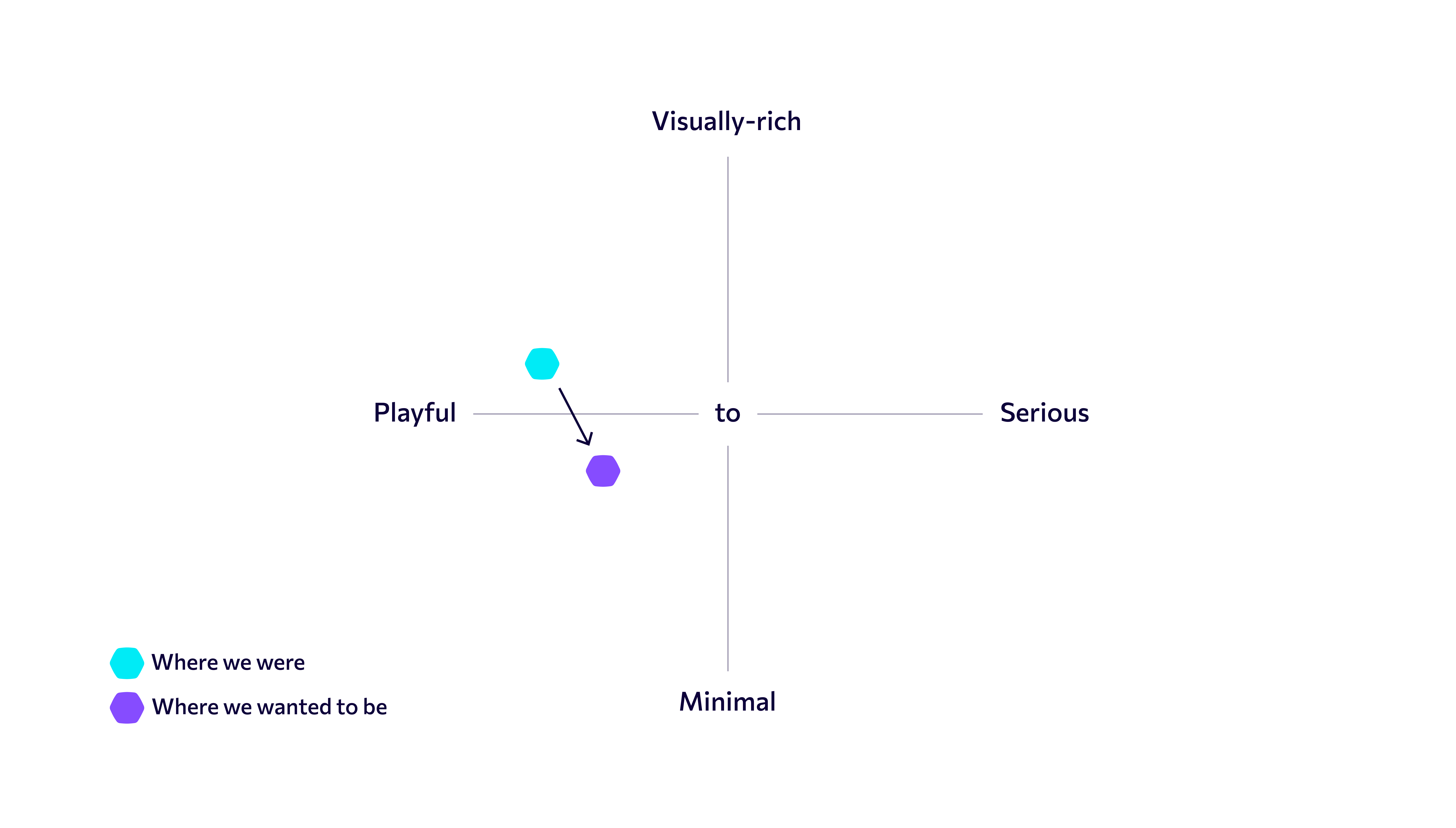
We spent a lot of time on this project thinking about what makes eduMe, eduMe.
We decided to create a range of scales to help us determine where our visual identity currently sat, and where we wanted the new branding to take us. We didn’t want to lose our signature playfulness, but we did want to move away from a visually rich style to something more minimal.
We needed a brand that captured the right balance: approachable but informative, playful but powerful, flexible but trustworthy, confident but transparent. eduMe provides companies with innovative, robust technology that’s designed to engage and empower their workers on a human level. We deliver efficiency and productivity, without compromising on experience.
Our goal was therefore to create a look that was a better representation of the innovative, forward-thinking business that we’ve become. One that was recognizable as a hyper growth SaaS company, but still had that eduMe spark.
We also wanted to ensure that this rebrand wasn’t merely cosmetic. Accessibility is our key differentiator as a seamless learning provider, and we felt strongly that our look needed to be just as accessible and dynamic as our product.
The new brand
Presenting: the new eduMe!
Logo, colors and other brand elements
Let’s start with our logo, one of the most notable changes to our brand. We wanted to create an icon which represented eduMe’s role, which is to unify companies with their deskless workers. Our platform acts as a bridge between these two groups and fosters better communication, loyalty and productivity, and the two hexagons meeting in the middle is a symbol of that relationship.
So, why hexagons? They’re highly functional shapes which fit the playful but modern direction that we were aiming for, working well both in our logo and across our brand imagery. We also decided to opt for a more rounded hexagon that’s both dependable and dynamic, flexible to change and with a playful flair. 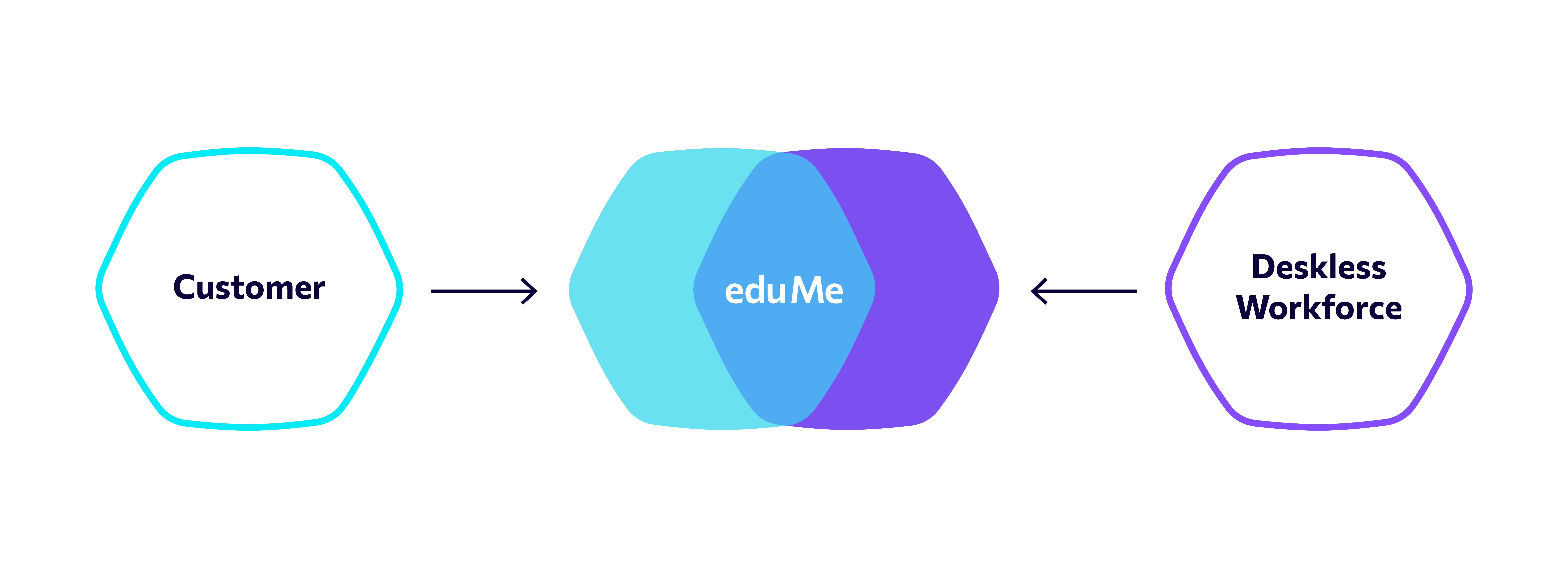
Though our old colors served us well, we felt that they had become too muted and outdated, and we wanted something punchier. Our new color palette - consisting of Purple, Blue, Aqua and Navy - was therefore chosen to be bold and distinctly ours, with a focus on legibility and accessibility. As such, all color combinations have been tested against accessibility standards and documented.
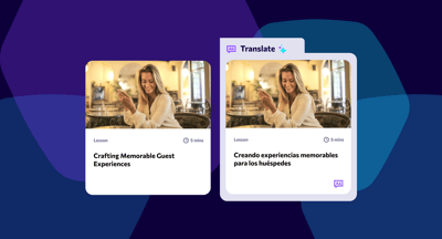
This also extends to our new typeface, Commissioner, which is not only more legible on screen, but also has great language support, meaning that all of our customers worldwide are supported and can have the same high quality experience.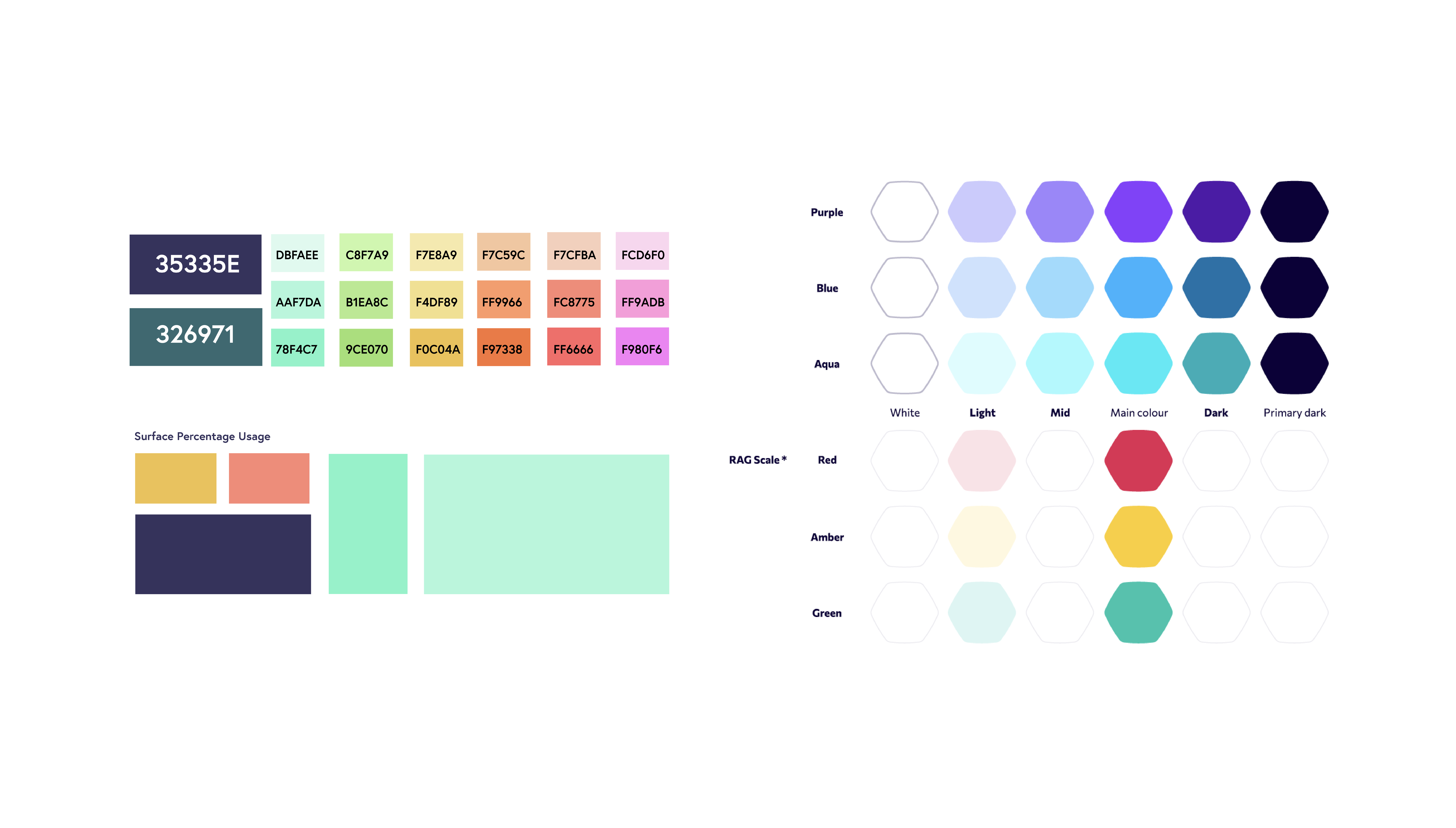
Website and Help Center
We love a challenge at eduMe, so we decided that we wanted to build a brand new website, blog and Help Center alongside our rebrand. Our old site was in need of an update, and we wanted to take this opportunity to completely overhaul how we present ourselves - and our product - online.
Before: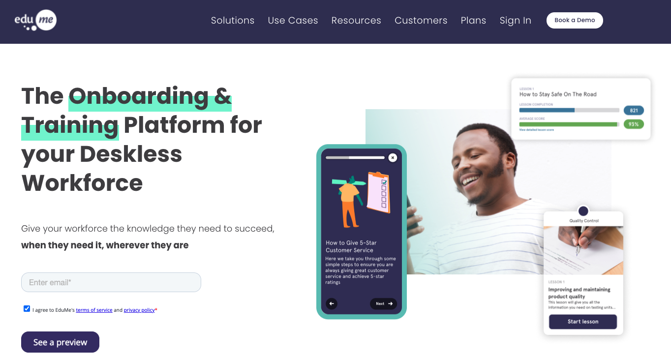
Now:
Our new website now has a centered layout with the navigation bar sitting on the left. This was a conscious decision to replicate the mobile experience - which is at the core of our business - across our digital landscape, and make it even easier for users to navigate our site and find exactly what they’re looking for.
Giving visitors a better insight into what our product looks and feels like was important to us, so you can now find a range of images and animations demonstrating our key features on both the user and admin levels.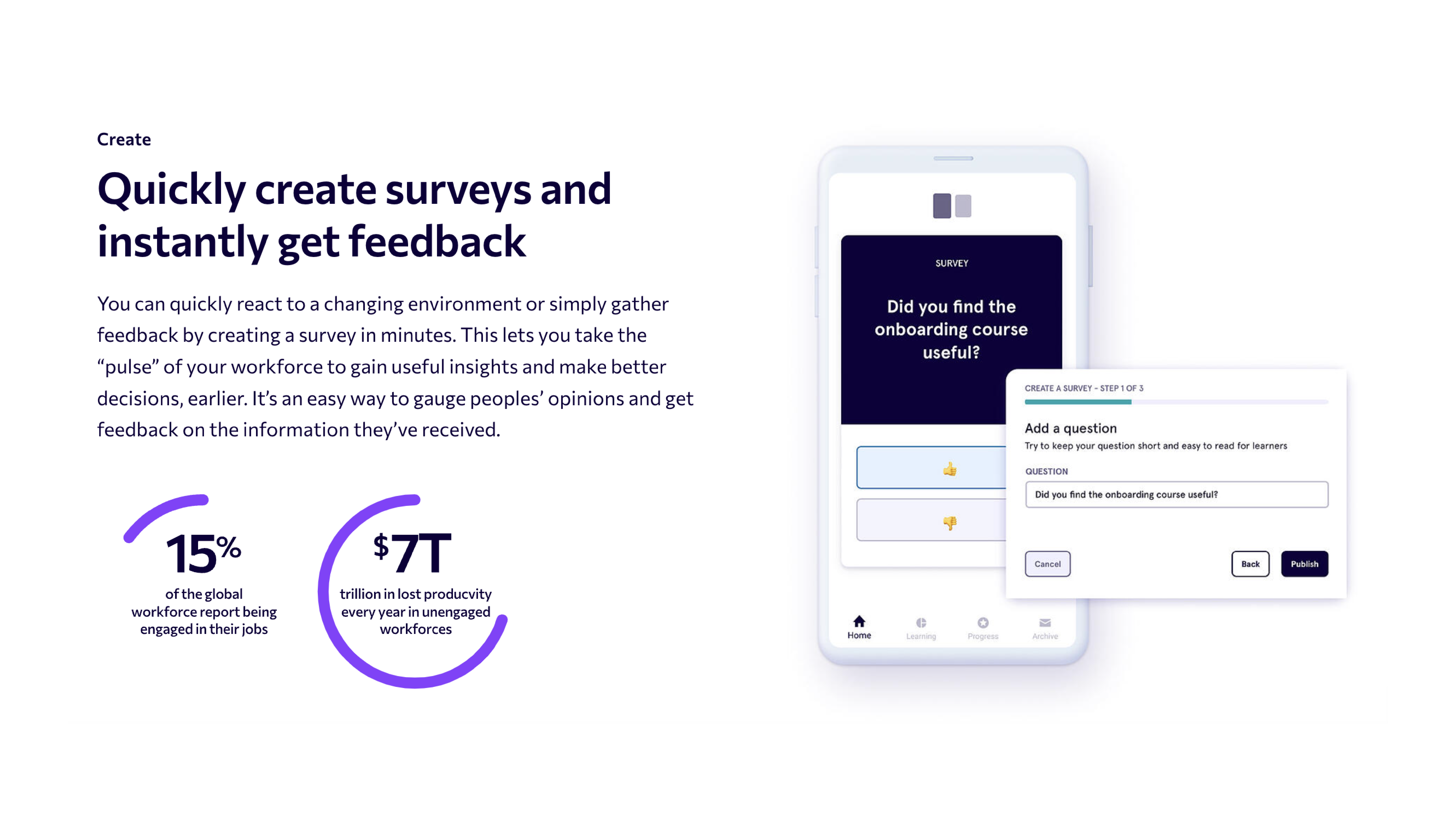
Our Blog has received an upgrade, and is now organized into categories, industries and even some Editor’s Picks for those who need some inspiration. Our Help Center has also been restructured, making it even easier for users to find the information they need.
Finally, if you were familiar with our old brand, you may have spotted an absence of character illustrations. We made a conscious decision to move away from these playful images in order to put real life use cases front and center, giving context to the challenges and solutions we’re talking about and creating a stronger visual nod that’s grounded in the day-to-day reality of the people eduMe serves.
What this means for our customers
Changes to the admin experience
Before: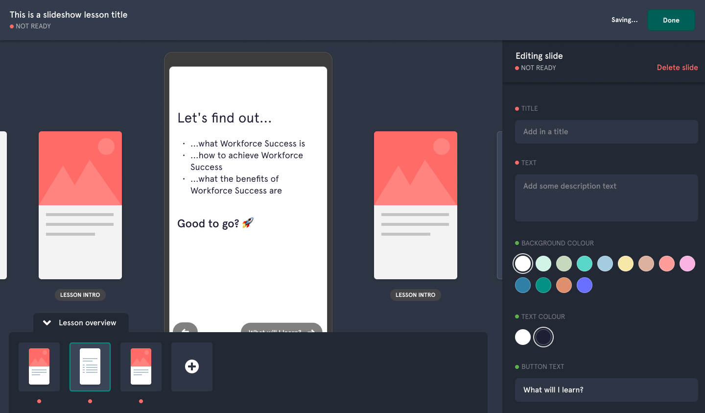
Now: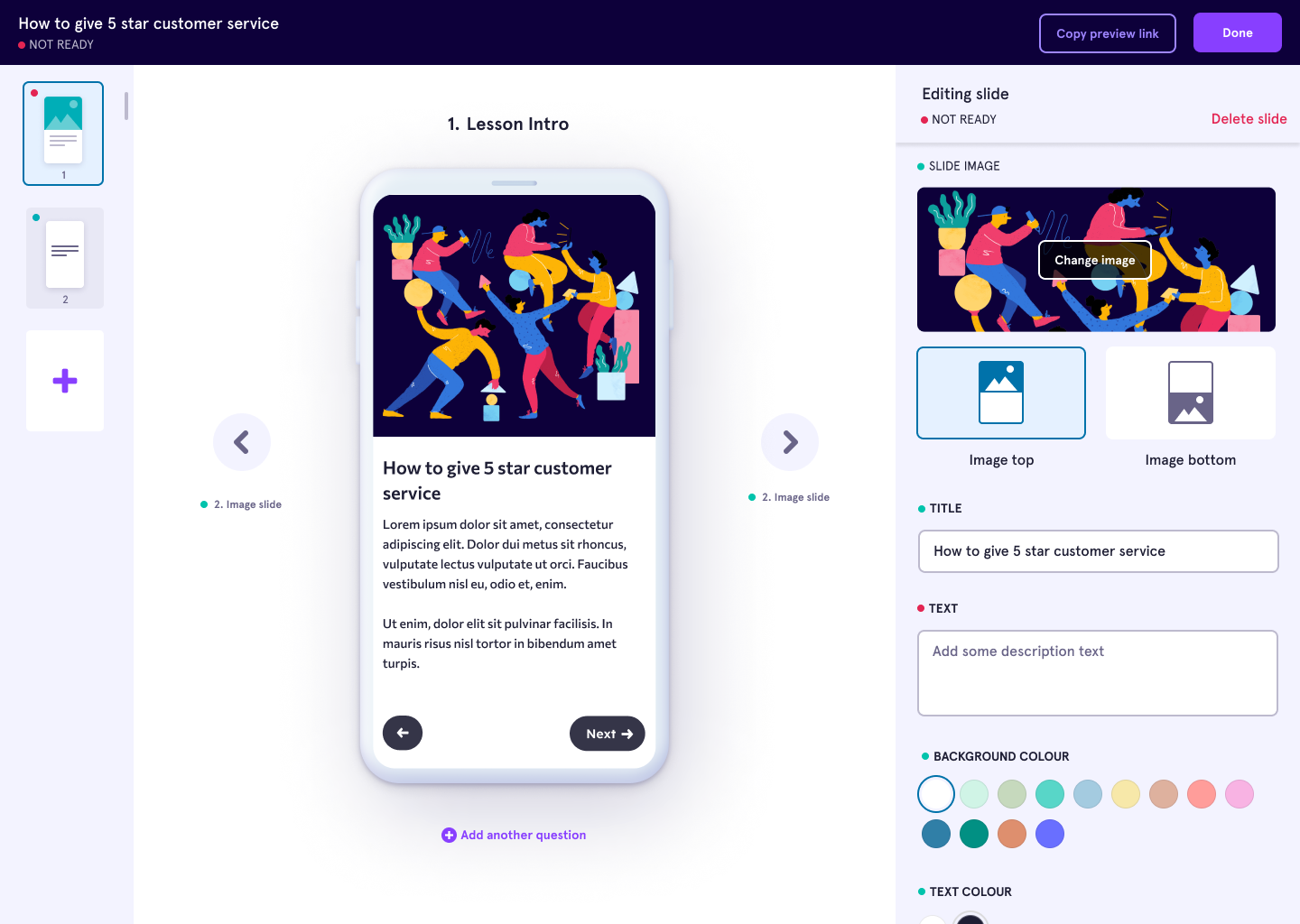
The biggest changes to the admin platform are our new colors. The main interactions have been changed from dark green to purple, and we have improved the color contrast of text so that it’s easier to read, especially for those with visual impairments.
There have also been some tweaks to layout in order to help improve the user experience, most significantly in the slideshow builder. Here, we have enlarged the editing panel and removed some of the less useful components, creating an experience that’s more focused. We’ve also moved the ‘Activity Overview’ panel from the bottom of the screen to the left hand side, meaning that the main phone preview is fully visible.
None of these changes alter any of the existing functionality - they simply elevate the experience and make the process of content creation even more intuitive for our customers.
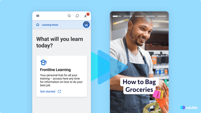
Changes to the learner experience
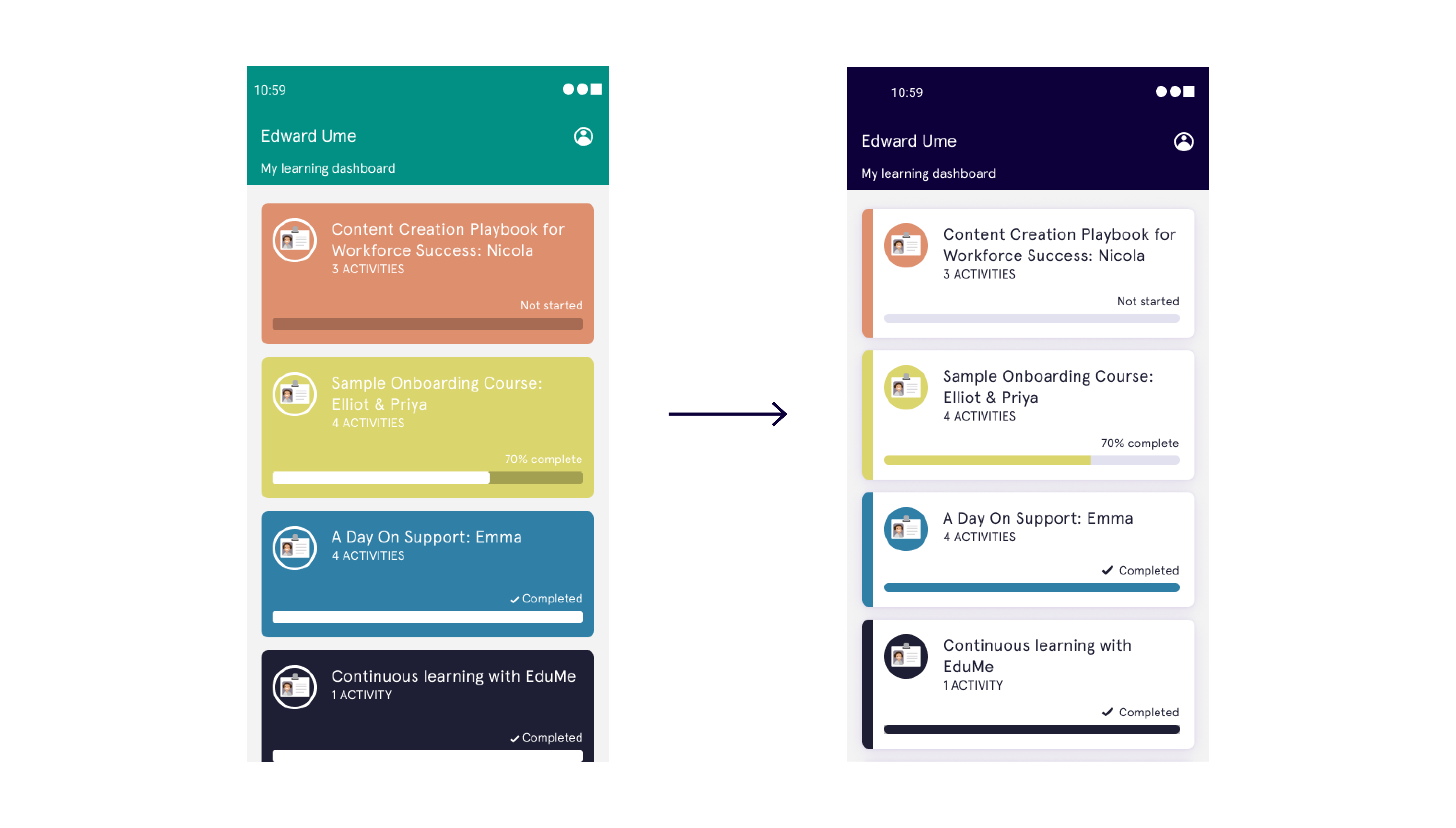
The learner view has also benefited from color updates. Colors are now used more sparingly and this pared back UI means that any switch between platforms is less noticeable for users accessing eduMe lessons via their native app.
Similarly, the colors used on our course lists are more subtle, allowing them to be combined more easily with chosen company colors, helping our clients better convey their brand identity through the learning experience.
The improved color contrasts are also implemented here, ensuring that everyone is able to access the information they need.
We’re always evolving
A lot of work has been put into this rebrand and we’re extremely proud of what our team has achieved, but the work doesn’t stop here. Over the coming months our product will continue to grow, as we strive to create a better experience for our customers.
We're really excited about this next phase of eduMe, and to have you all along for the ride.